Data visualization
keywords: ALFA, visualization
OUTLINE
- Line plot
- Pie chart
- Histogram
- Bar plot
- Box plot
- Violin plot
- Scatter plot
- Multi-scatter plot
- Relationship heatmap
- Correlation map
Note: All the figures are editable. Once a figure is plot, a menu will appear on the right side of the GUI to manually modify different plot parameters.
Command Syntax: You can use any command as long as it contains enough information to unambiguously identify user's intentions. For example if we want to create a pie chart, any of the following commands will work:
plot pie chart
pie
pie plot
pie graph
We are going to illustrate each of the visualization functions on the following example dataset
| Label | Column1 | Column2 |
|---|---|---|
| Group1 | 250 | 54 |
| Group1 | 350 | 27 |
| Group1 | 234 | 25 |
| Group1 | 223 | 36 |
| Group1 | 210 | 45 |
| Group2 | 45 | 220 |
| Group2 | 35 | 300 |
| Group2 | 25 | 400 |
| Group2 | 33 | 620 |
| Group2 | 27 | 270 |
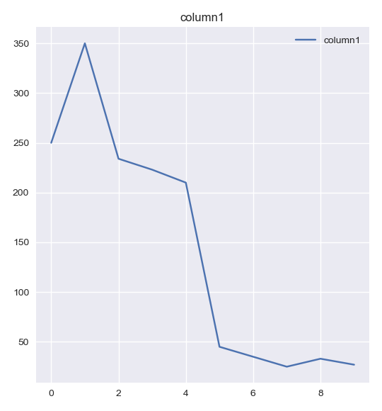
1. Line plot
Line plot plots two variables against each other connected by a line segment. The figure below shows a line plot corresponding to column1.
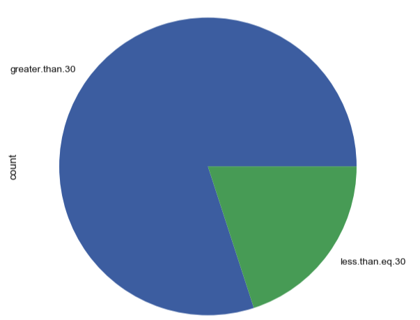
2. Pie chart
A pie chart is a visualization technique used to visualize the numerical portion for different quantities. The arc length or the angle for each group is directly proportional to the quantity represented. For a categorical variable, a pie chart can be used to visualize the number of observations corresponding to each category.
For our example dataset, consider column1. If we divide the data into two groups (values greater than 30 and less than 30), the pie chart would look as follows:
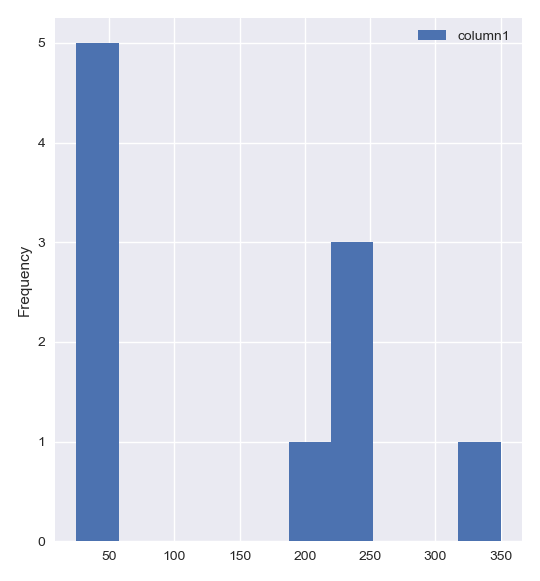
3. Histogram
A histogram plot is used to visualize the distribution of data points for different variables in the dataset.
The figure below shows the histogram for our dataset with label as our reference/ground_truth
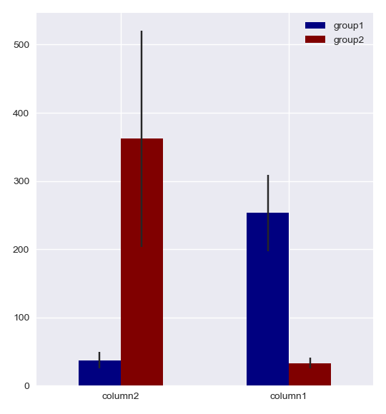
4. Bar plot
A bar plot is used to visualize and compare the distribution of different variables in terms of their mean and standard deviation. A bar plot can also be used to visualize the distribution of the same variable across multiple categories by setting the categorical variable as your reference.
The figure below shows the bar graph for our dataset with label as our reference/ground_truth
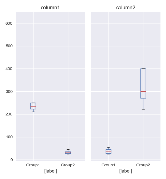
5. Box plot
A box plot is used to visualize and compare the distribution of different variables in terms of their median and the interquartile range.
The figure below shows the box plot for our dataset with label as our reference/ground_truth
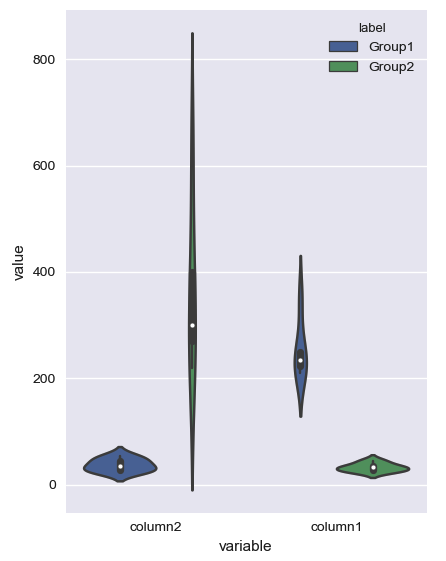
6. Violin plot
A violin plot is used to visualize and compare the actual distribution of different variables.
The figure below shows the box plot for our dataset with label as our reference/ground_truth
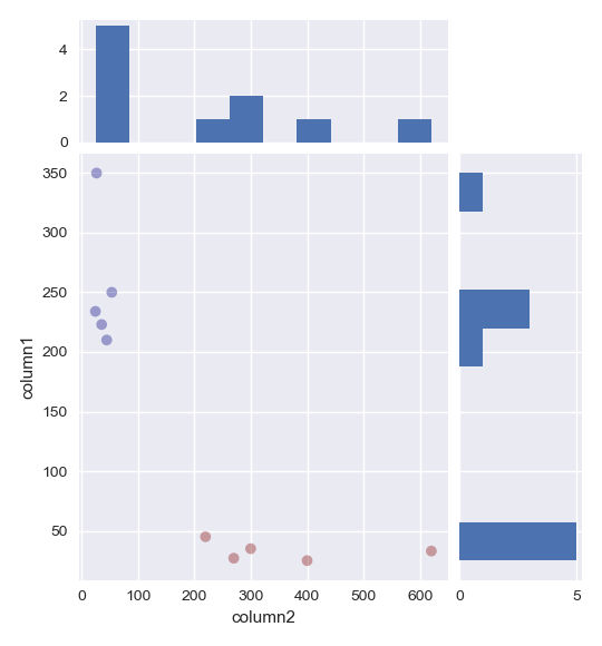
7. Scatter plot
A scatter plot is used to visualize the relationship between two variables. The scatterplot can be further modified to add the trend line or the data distribution plots to the figure. The ground truth can be further visualized by adding a color scale to the points on the scatterplot.
The figure below shows the scatterplot for our dataset with label as our reference/ground_truth
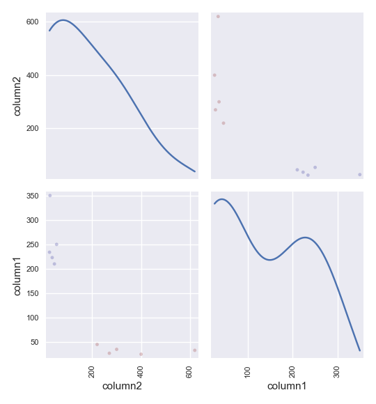
8. Multi-scatter plot
A multi-scatter plot is used to visualize the relationship between multiple variables. All the features The figure below shows the multi-scatterplot for our dataset with label as our reference/ground_truth
9. Relationship heatmap
A comparative heatmap is similar to a scatterplot except that it plots the relationship in the form of a heatmap instead of a scatter plot and is only used to visualization relationship between categorical variables.
10. Correlation plot
A correlation plot visualizes the correlation coefficient between multiple variables and displays it in the form of a color coded matrix. An example correlation map for our dataset is shown below:
